The 3.5GB download went quickly enough for me on our office network, and the installation process itself was completely pain free. I'm not sure I was asked a single question. Such a change from Microsoft Windows installs of yesteryear, which would chug along for hours before requesting user input, then chug along some more!
First impressions:
- Inverted scroll takes some getting used to, but it's intuitive enough if you have an iPhone. The correct scroll direction would be more obvious if the mouse cursor turned into a 'grab' icon when you place two fingers on the trackpad (I remember this scrolling mode from old versions of Adobe Acrobat), but they probably decided this would be too ugly.
- I'm delighted that you can finally resize windows from any corner or side. In typical Jobsian style, there's no clumsy border to suggest that this may be possible, but the mouse cursor changes appropriately on hover. Users have had plenty of time to get used to window-based UIs, so a border really would have been superfluous.
- Scroll bars are similarly unobtrusive, appearing only when you start to scroll.
- Mission Control is quite cool, and the three-finger swipe gestures work well (Ctrl+arrow keys achieve the same effect, though annoyingly you have to release and reapply the Ctrl key between going left/right and going up).
- When you log out, Lion offers to remember your windows. Combined with fast SSD start-up times, this means I might actually shut my laptop down from time to time, rather than leaving it sleeping or hibernating.
- The iOS-style Launch Pad may be useful for some people, but I don't think it's a vast improvement over having the Applications folder in Grid mode in the Dock. If you have lots of applications, the quickest way to launch them is still to hit Cmd-Space and type the app name in Spotlight.
- In Safari, a two-finger double tap gives iPhone style smart zoom; probably not enough to get me to move away from Firefox, but I might give Safari another try.
- Apple Mail is greatly improved. The new layout makes good use of wide screens, and "full screen mode" means you don't need to waste a single pixel. Full screen apps act as their own workspaces, so you can flick between them and the Desktop and Dashboard using the handy three-finger horizontal swipes.
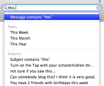
- Most exciting, though, is Apple Mail's new search mode. As you type arbitrary text in the search box, Mail offers to restrict results according to person, subject, or date ranges. You can specify multiple constraints, and (as with the previous version) you can save these as Smart Mailboxes. Very well thought out.
- Finder has similar features, so I might finally start using it rather than dipping down to Terminal.app whenever I need to find anything (for the times when the CLI really is the right answer, the 'open' command remains very useful for jumping back to GUI land).


At £20 quid, this upgrade is a bargain. If you have reasonably new hardware, and you aren't reliant on broken Adobe apps, I'd definitely recommend it.
UPDATE
When I wrote
"for the times when the CLI really is the right answer, the 'open' command remains very useful for jumping back to GUI land"I hadn't actually noticed the folder bar at the top of the new Terminal. Right-clicking on this will let you jump back to Finder quite easily (though I expect I'll continue to use "
open ." or "open ..").

I read your review and took the plunge, whilst also upgrading all the iWork app's (I had previously stuck with 2008).
ReplyDeleteI'm really enjoying the autocorrect feature and natural scrolling worked fine for me (I think my brain had been programmed by a year's use of the iPad).
I'm giving Safari a try (I used to be Chrome only) and find the reading list useful and the reader view (which I understand has been around for a while but I haven't used it for ages).
I think full screen mode has a lot of potential but I am so used to having a 27" iMac and running two or more things side by side that I may not make full use of it. Although I do like how a full screen application is given its own "space" and the gestures to move between them are a very nice touch.
I'll +1 your recommendation.
Cheers Andy. Glad you're liking it.
ReplyDeleteFair point about running apps side by side. In fact, unless there's a feature I'm not aware of, this is one of the few areas where Windows is actually superior: OSX doesn't provide a way to tile windows.
I think it can be done with AppleScript, but it's crazy that they don't have it built in.